We live in a time where AI is taking over the internet by storm. It can generate almost anything these days.
I could write an entire essay about how AI should free us from mundane tasks, giving us more time to create art, not create the art for us.
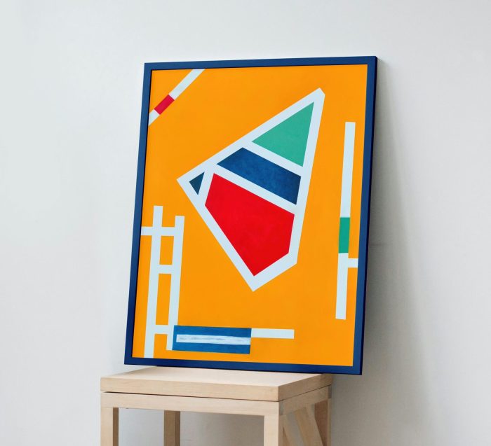
That frustration became the foundation for (Dis)Order.
The center of the painting was designed to feel structured and almost mechanical. Clean geometric forms, balanced proportions, and crisp white lines create a sense of order, control, and precision. To me, it represents the endless stream of “polished”, emotionless imagery that AI increasingly floods the internet with.
The outer forms were created with a completely different intention.
Rather than pursuing perfect symmetry, I deliberately painted them by hand, allowing subtle irregularities, softer edges, and visible brushwork to remain. They aren’t mistakes to be corrected. They are evidence of the human hand that created them.
The white boundaries extend outward from the centre, gradually pushing into these more expressive forms. To me, they represent technology attempting to impose structure, efficiency, and perfection onto something that was never meant to be perfectly ordered. It’s trying to derive rules from emotions where none exist.
Yet the surrounding colours never become completely uniform.
They resist. They blend. They feel alive.
In a world increasingly defined by automation and optimisation, their imperfections became the most important part of the painting.
The internet once felt like a place of knowledge and discovery. Today, it often feels buried beneath an endless stream of algorithmic content meant to deceive or confuse.
Of course, there isn’t a single correct interpretation.
Some people may see architecture.
Some may see technology.
Others may see the relationship between humanity and artificial intelligence.
Or perhaps you’ll simply enjoy the balance between colour, geometry, and texture.
Whatever you discover, I hope (Dis)Order encourages you to pause for a moment and consider what makes something feel genuinely human.

If (Dis)Order resonates with you, museum-quality Fine Art Prints are also available in A2, A1, and A0, with optional framing for A2 and A1. Each print is produced from a high-resolution reproduction of the original painting using archival pigment inks on museum-quality Fine Art paper, faithfully preserving the colours and character of the original artwork.
You can find the Etsy listing here.
Thank you for taking the time to experience my work.
Warm regards,
James Gale

Leave a Reply